Stack Systems Overview
Unified Layout Architecture
The stack patterns on this page use the existing grid and flex utilities to build responsive content combinations for cards, forms, banners, and mixed content sections. Both approaches use the shared gap utilities (.gap-xxs to .gap-xl) and align with the design system spacing tokens.
Grid-based stacks
- Use
display: gridthrough the.gridclass. - Set columns with utilities such as
.grid-cols-1through.grid-cols-12. - Control item width with
.col-span-*utilities and responsive variants likemd:col-span-6orlg:col-span-4.
Flex-based stacks
- Use
display: flexthrough.flexor the direction helpers. - Control direction with
.flex-h,.flex-v,.flex-h-rev, and.flex-v-rev. - Control wrapping with
.wrapand.wrap-rev. - Responsive shifts are supported with classes such as
md:flex-handlg:flex-v.
Responsive Utility Integration
Stack layouts respond at the system breakpoints using modifier prefixes like md:, lg:, and xl:. This allows orientation, column count, span, spacing, and alignment to change without changing the HTML structure.
Design Token Alignment
These stack patterns work with the existing token system for spacing, typography, color, and surfaces. They can be combined with card, background, tint, and surface utilities without adding one-off layout classes.
Accessibility and Semantic Structure
Stacks should be applied directly to meaningful HTML elements such as <section>, <div>, or list structures when appropriate. Layout utilities should support the content order, not replace semantic structure. Keep the source order logical so reading order and keyboard flow remain clear.
Modular Reusability
Stack layouts are composable. Content can be nested, reordered, or resized using the existing grid and flex utilities while keeping spacing and alignment consistent across the page.
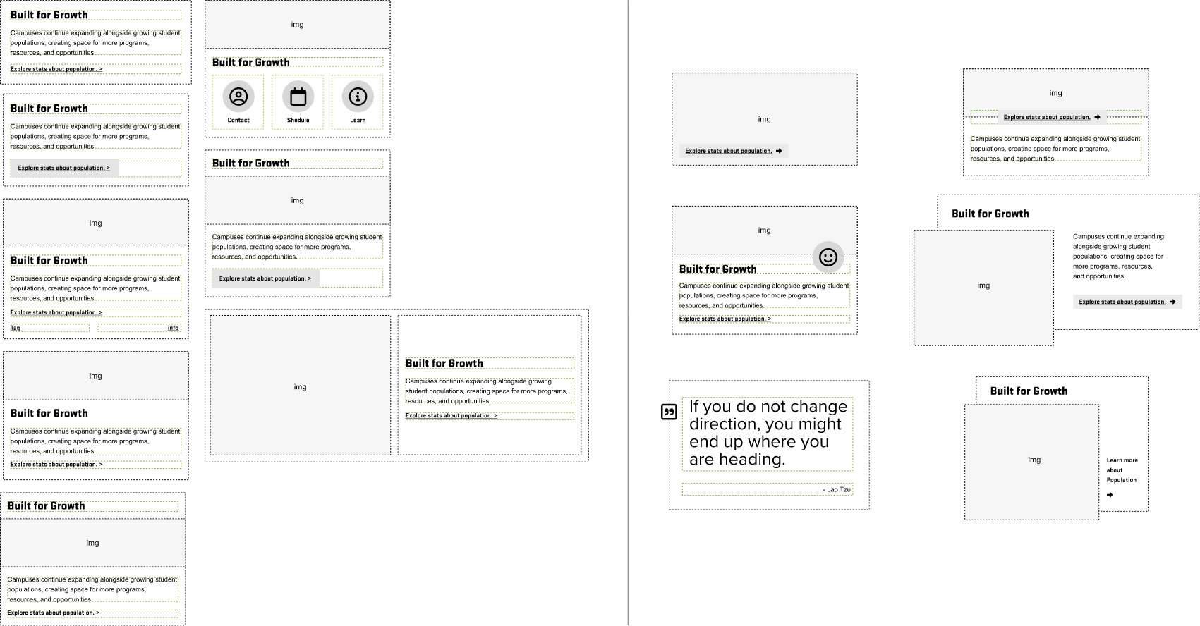
Card Stacks
Use a simple flex stack when the content should flow as one group and shift direction across breakpoints. This pattern works well for heading plus body layouts inside cards or panels.
Card Stacks
Use flex when the content should stack vertically first and then shift horizontally at a breakpoint. This helps preserve readable source order on smaller screens.
Card Stacks
Surface styles can be layered with stack layouts, but the stack behavior still comes from the grid and flex utility classes.
Card Stacks
Use inner flex stacks when a single card needs grouped content that changes orientation across breakpoints.
Keep the text order meaningful so the visual shift does not create confusion for reading or focus flow.
.flex-v and shifts to md:flex-h. Use this pattern when the content should stack on small screens and align in a row on larger screens.flex-h md:flex-v lg:flex-h. This pattern shows how layout can change more than once when the content needs a different reading shape at different breakpoints.Card Stacks
Grid item alignment helpers can position content inside a card or grid item without changing the outer layout structure.
Primary: call-to-actionplacement shift
This item changes alignment at breakpoints using the existing item alignment helpers.
It seems that you have reduce motion enabled!